Use themes
Themes are one of the most important things in BellJs as they give you the opportunity to choose between different designs and find the one that best suits your system. Or create your own.
Using a theme
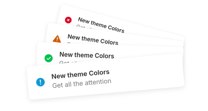
BellJs does not load the Extra default themes to improve performance. If you want to try all the themes it’s as easy as importing the CSS allThemes.css or if you want to import just the one you’re going to use light.css.
import 'bell-alert/dist/themes/light.css'<link type="stylesheet" rel="https://www.unpkg.com/bell-alert/dist/themes/light.css"/><link type="stylesheet" rel="https://cdn.jsdelivr.net/npm/bell-alert/dist/themes/light.css"/>To use a theme it is as easy as selecting it. To do this we must modify the theme property of the third parameter of Bell. Here is an example:
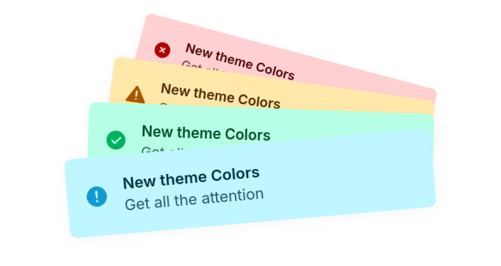
new Bell({title: "Using the light theme"},"info",{theme: "colors"}).launch()With this done all the alert types will change their design.
Create a theme
Creating themes is an efficient way to customize our alerts without having to change each one. But first of all we must know how these themes work.
- BellJs CSS variables.
- Theme name and restricted names.
- Using the new themes.
BellJs CSS variables
Themes and most of all BellJs works with variables to improve the development environment for both the team and the users who use or modify the library. These are the variables that BellJs uses:
| Variable name | Use | Example |
|---|---|---|
--b_t | Defines the title color | --b_t: white; |
--b_d | Defines the description color | --b_d: black; |
--b_bg | Defines the alert background color | --b_bg: red; |
--b_svg | Defines the icon color | --b_svg: blue; |
--b_br | Defines the border color | --b_br: gray; |
--b_t | Defines the title color | --b_t: white; |
--b_tm | Defines the animation time of the timeline | --b_tm: 5000ms; |
--b_h | Defines the height of the alert | --b_h: 40px; |
--b_w | Defines the width of the alert | --b_w: 120px; |
With this in mind we can start modifying the variables to create our own theme, remember that we must modify each of the possible types such as info, error or others:
/* New Theme */
.b_c.info {--b_svg: rgb(14 105 190);--b_t: rgb(20 114 202);--b_d: rgb(24 96 139 / 0.8);--b_bg: rgb(245 252 255); --b_br: rgba(8, 145, 199, 0.35);} .b_c.warning { --b_svg: rgb(197 82 10); --b_t: rgb(160 62 0); --b_d: rgba(139, 85, 24, 0.8); --b_bg: rgb(255 248 235); --b_br: rgba(199, 84, 8, 0.3);} .b_c.error { --b_svg: rgb(199, 8, 8); --b_t: rgb(181, 5, 5, 0.9); --b_d: rgba(139, 24, 24, 0.8); --b_bg: rgb(255 245 245); --b_br: rgba(199, 8, 8, 0.3);} .b_c.success { --b_svg: rgb(37 169 44); --b_t: rgb(33 117 26); --b_d: rgb(51 117 38 / .8); --b_bg: rgb(246, 255, 250); --b_br: rgb(53 137 0 / .35);} .dark .b_c.info { --b_svg: rgb(47 130 206); --b_t: rgb(64 143 217); --b_d: rgb(113 191 238 / 80%); --b_bg: rgb(36 38 39); --b_br: rgb(32 77 95 / 35%);} .dark .b_c.warning { --b_svg: rgb(212 104 36); --b_t: rgb(185 100 46); --b_d: rgb(220 150 72 / 80%); --b_bg: rgb(41 40 36); --b_br: rgb(133 100 9 / 30%);} .dark .b_c.error { --b_svg: rgb(208 59 59); --b_t: rgb(222 72 72 / 90%); --b_d: rgb(225 94 94 / 80%); --b_bg: rgb(41 37 37); --b_br: rgb(143 47 47 / 30%);} .dark .b_c.success { --b_svg: rgb(57 206 65); --b_t: rgb(85 185 76); --b_d: rgb(137 235 118 / 80%);--b_bg: rgb(44 47 45);--b_br: rgb(53 137 0 / 18%);}
Save the CSS file with the name of this new theme.
Theme name and restricted names.
The next step is to give our theme a name, although you should not use restricted names from BellJs to avoid problems, some of them are:
| Restricted name | Use |
|---|---|
.b_c | Alert container CSS class |
.b_p | Alert container parent CSS class |
.b_close | Remove button CSS class |
.b_i | Icons or svg CSS class |
.b_t-c | Text container CSS class |
.b_t | Title CSS class |
.b_d | Description CSS class |
.b_t_p | Promise title CSS class |
@keyframes b_a-timeline | Timeline animation name |
@keyframes b_a-svg | Promise icon animation name |
We should also not use the name of an existing theme as a theme name. Example: colors
const theme = "newTheme"Use created theme
Now with everything already created we can use the created theme, remember to have imported the CSS of the new theme.
import 'newTheme.css';
new Bell({title: "Using a new theme"},"info",{theme: theme}).launch()<link type="stylesheet" rel="./newTheme.css"/>new Bell({title: "Using a new theme"},"info",{theme: theme}).launch()Now you can see your new theme created. If you think your theme can help or please other people, what are you waiting for? Send a PR to the BellJs repo and share your creations now.